Agenturen entdecken
Entdecken und durchstöbern Sie unseren gesamten Katalog von Anbietern.
Posten Sie ein Projekt
Posten Sie jetzt ein neues Projekt und finden Sie die Anbieter, die Ihren Anforderungen am besten entsprechen.
Lassen Sie sich beraten
Unsere Branchenexperten helfen Ihnen bei der Auswahl des für Sie am besten geeigneten Anbieters. Kostenlos.
Durchsuchen Sie unsere Anbieter
Durchsuchen Sie eine Datenbank mit 38.000 talentierten Dienstleistern und arbeiten Sie mit den besten für Ihre spezifischen Anforderungen zusammen.
Entwicklung & Produkt
2D Animation2D Design3D3D Animation3d Design3D Modeling3D Printing3D RenderingAnimationAudio ProduktionAudiovisuelle ProduktionBenutzererfahrungDesignFotoGrafische IdentitätPrint DesignUsability TestingVideobearbeitungVideo MarketingVideoproduktionAffiliate MarketingAmazon MarketingAußenwerbungBrandingCommunity ManagementContent EntwicklungContent-MarketingDigital CopywritingDigitale BeratungDigitale InnovationDigitales MarketingE-Mail-MarketingEventEventmanagementGrowth MarketingInfluencer MarketingInvestor RelationsKommunikationsstrategieMarketingMarketing-AutomatisierungAWS BeratungAzure BeratungBeratungBI-App-EntwicklungBlockchain BeratungBlockchain EntwicklungCloud BeratungCloud ComputingCRM BeratungCyber SecurityDaten-ConsultingDomain ManagementERP BeratungIT SicherheitPenetrationstestsSaaS Strategy ConsultingServer-KonfigurationSmart Contract DevelopmentSystemintegrationsdiensteWebsite Administration
Nicht das, wonach Sie suchen?
Alle Dienstleistungen durchsuchenLassen Sie die Anbieter zu Ihnen kommen
Beschreiben Sie Ihren Bedarf in einem kurzen Briefing mit Ihren Anforderungen. Senden Sie es an die von uns vorgeschlagenen Anbieter und warten Sie auf deren Antwort.
- Einfacher, schneller und agiler Prozess
- Vollständige und aktuelle Marktinformationen
- Persönliche Unterstützung
Ein Projekt veröffentlichen für:
- 3D
- Werbung
- Künstliche Intelligenz
- Audio Produktion
- Blockchain Entwicklung
- Markenbildung & Positionierung
- Cloud Services
- Community Management
- Content-Strategie
- Textgestaltung
- Unternehmenskommunikation
- Cybersecurity
- Datenberatung
- Digitale Strategie
- E-Commerce
- E-Mail-Marketing
- Ergonomie (UX/UI)
- Event
- Game Entwicklung
- Grafikdesign
- Grafische Identität
- Growth Marketing
- Digitale Strategie
- E-Commerce
- E-Mail-Marketing
- Ergonomie (UX/UI)
- Event
- Game Entwicklung
- Grafikdesign
- Grafische Identität
- Growth Marketing
- Influencer Marketing
- Innovation
- Marketing
- Marktforschung
- Mediaplanung
- Mobile App
- Motion-Design
- Onlinewerbung
- Außenwerbung
- Verpackungsdesign
- Fotografie
- Produkt Management
- Öffentlichkeitsarbeit (PR)
- SEO
- Social Media
- Software Entwicklung
- Videoproduktion
- Webanalytik/Big Data
- Webanwendung
- Website Administration
- Webseitengestaltung
Unsere Berater helfen Ihnen, den richtigen Anbieter zu finden
Lassen Sie sich von unseren Branchenexperten bei der Auswahl des am besten geeigneten Anbieters helfen und verwandeln Sie Ihre Idee in ein erfolgreiches Geschäftsprojekt.
Erfahren Sie mehr zu Beratern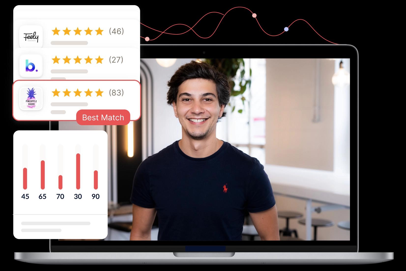
Fedoriv
Fedoriv is an award-winning design and marketing company specializing in multi-media, technology-savvy design and content production. We believe in the combined power of creativity and business. Whatever you want to create - design a multi-media corporate identity , open a retail space, rebrand your company, roll out a new product brand, design an event or show, build a residential quarter, publish a magazine or promote a multimedia hub - we are here to be your partner!
Noch keine BewertungSchreiben Sie die erste Bewertung
Dieses Profil wird nicht vom Eigentümer der Agentur verwaltet. Sind Sie der Eigentümer? Diese Agentur claimen
Dienstleistungen
17 Dienstleistungen angeboten von Fedoriv
Beschreibung Für diese Dienstleistung ist keine Beschreibung vorhanden.
Skills in Markenbildung & Positionierung (29) Corporate DesignProduct BrandingBrand DesignNamingCorporate IdentityBrand BookCorporate BrandingRebrandingBranded ContentInnengestaltung+19Referenzen in Markenbildung & Positionierung (12)
Erfahren Sie mehr über Markenbildung & PositionierungBeschreibung Für diese Dienstleistung ist keine Beschreibung vorhanden.
Skills in Motion-Design (11) Trailer3DimagefilmeProduktvideosErklärvideosViralsOnline-SpotsAnimationenBewegtbildstrategieTV-Spots+1Referenzen in Motion-Design (3)
Erfahren Sie mehr über Motion-DesignBeschreibung Für diese Dienstleistung ist keine Beschreibung vorhanden.
Skills in Grafikdesign (9) DesignInterior DesignKey VisualCorporate DesignLogostypografieVerpackungsdesignMagazin DesignLogo Graphic DesignReferenzen in Grafikdesign (11)
Erfahren Sie mehr über GrafikdesignBeschreibung Für diese Dienstleistung ist keine Beschreibung vorhanden.
Skills in Fotografie (1) BildspracheReferenzen in Fotografie (8)
Erfahren Sie mehr über FotografieBeschreibung Für diese Dienstleistung ist keine Beschreibung vorhanden.
Skills in Werbung (15) Klassisches MarketingPrint-AnzeigenPlakat-KampagneCampaigning WerbungKindermarketingwerbungmarketingstrategietestimonialsDisplay-MarketingDisplay Marketing+5Referenzen in Werbung (4)
Erfahren Sie mehr über WerbungBeschreibung Für diese Dienstleistung ist keine Beschreibung vorhanden.
Skills in Textgestaltung (1) Werbetexte
Erfahren Sie mehr über TextgestaltungBeschreibung Für diese Dienstleistung ist keine Beschreibung vorhanden.
Skills in Content-Strategie (2) Content-MarketingContent MarketingReferenz in Content-Strategie (1)
Erfahren Sie mehr über Content-StrategieBeschreibung Für diese Dienstleistung ist keine Beschreibung vorhanden.
Skills in Ergonomie (UX/UI) (1) Interface DesignReferenzen in Ergonomie (UX/UI) (2)
Erfahren Sie mehr über Ergonomie (UX/UI)Beschreibung Für diese Dienstleistung ist keine Beschreibung vorhanden.
Skills in Onlinewerbung (1) Online-marketingReferenz in Onlinewerbung (1)
Erfahren Sie mehr über OnlinewerbungBeschreibung Für diese Dienstleistung ist keine Beschreibung vorhanden.
Referenzen in Event (3)
Erfahren Sie mehr über Event
Team
100 Mitglieder in Fedoriv's Team
Auszeichnungen
Fedoriv wurde 4 Mal ausgezeichnet
Red Dot Award2015-1-1
Red Dot Award2016-1-1
iF Design Award2015-1-1
Red Dot Award2014-1-1
Bewertungen
Noch keine Bewertung für Fedoriv
Haben Sie mit Fedoriv gearbeitet?
Teilen Sie Ihre Erfahrungen mit uns.
Bewertung abgeben
Kontakt
Kontaktdetails von Fedoriv
Details
http://fedoriv.com
- HeadquarterKemperplatz 1, 10785 Berlin, Deutschland
- Velyka Vasylkivska Street 5, 01001 Kyiv, Ukraine